Button Grouping Block
Overview
The button grouping block is a container of multiple buttons whose actions are related to each other.
See the Travelers Design System's button component documentation page for more tips on using buttons and button groupings.
Contents:
- Block customization options
- Block examples
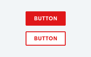
| Element | Required | Options Available |
|---|---|---|
| Button Size | Y |
|
| Button Style | Y |
|
| Button URL | N |
|
| Display Button Icon | Y |
|
Examples of button grouping variations
Default button group with primary, secondary, and tertiary buttons
| Primary Element | Option Selected |
|---|---|
| Button Size | Default |
| Button Style | Primary |
| Display Button Icon | None |
| Secondary Element | |
|---|---|
| Button Size | Default |
| Button Style | Secondary |
| Display Button Icon | None |
| Tertiary Element | |
|---|---|
| Button Size | Default |
| Button Style | Tertiary |
| Display Button Icon | None |
Button grouping with icons
| Primary Element | Usage |
|---|---|
| Button Size | Default |
| Button Style | Primary |
| Display Button Icon | First |
| Secondary Element | |
|---|---|
| Button Size | Default |
| Button Style | Secondary |
| Display Button Icon | First |
| Tertiary Element | |
|---|---|
| Button Size | Default |
| Button Style | Tertiary |
| Display Button Icon | First |
Small button group with primary, secondary, and tertiary buttons
| Primary Element | Usage |
|---|---|
| Button Size | Small |
| Button Style | Primary |
| Display Button Icon | None |
| Secondary Element | |
|---|---|
| Button Size | Small |
| Button Style | Secondary |
| Display Button Icon | None |
| Tertiary Element | |
|---|---|
| Button Size | Small |
| Button Style | Tertiary |
| Display Button Icon | None |