Blocks
Content Blocks
30/70 Panel Block
The 30% section can be used for quick intro, primary button, advertisements. The 70% section can be used to display content, such as articles, detailed information, or other data.
50/50 Panel Block
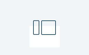
Highlights a single topic with an image and content options in a 50/50 display. Allows flexibility in left/right orientation.

Accordion Block
An accordion is a user interface pattern that allows users to expand and collapse sections of content.

Article Listing Block
Check out article listing block to explore it's capabilities.

Block Quote Block
Block quote block is used to show a quote on a page. Keep this block in mind while providing strong reasoning for the reader to relate to content.

Button Grouping Block
The button grouping block is a container of multiple buttons whose actions are related to each other.
CTA Inline Block
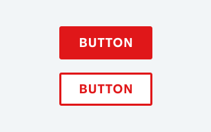
Call to Action (CTA) inline block provides way to get people to take action, obvi.
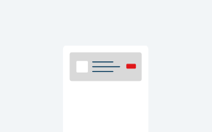
Image Block
Image block provides a way to add image block to a page template.

Info CTA Block
This block provides information and a encourages the visitor to take action.

Infographic Block
The Infographic Block provides a visual representation of data and information.

Layouts Block
Page layout is the arrangement of visual elements on a page.

Promo Block
Promo block allows content authors to have a section of a page for promotional purposes.

Rich Text Block
A rich text block is a versatile component that enables you to format and style text on a page. It allows you to easily incorporate elements like images, buttons, links, and more.

Site Alert Block
Site alerts provide contextually relevant feedback to the user about helpful information, warnings, errors, and success states.

Stripe Block
The Stripe Block is used to create an edge-to-edge background behind Rich Text Editor, Video & Transcript, and Image Blocks. The Stripe Block can be a color or an image.

Vertical Tab Block
The vertical tab block is used to display numerous blocks of content within one section of a page. The visitor toggles through each vertical tab label to view corresponding content.

Video Grouping Block
The Video Grouping Block displays a group of videos along with a transcript. It is a container block for two videos that appear side by side.

Video Listing Block
The Video Listing Block is an accordion-style block that displays a list of videos. The container functions like an accordion and is controlled by selecting a button.

Video & Transcript Block
Video & transcript block allows content author to add video and transcript to the page template.

Home & Hub Hero Block
The Home & Hub Hero Block in DXP is a flexible header component for home or other pages, featuring a large background image, main CTA, and customizable left and right content areas.

Card Blocks
Cards Block
A card contains content about a single subject. It provides a way for a user to access more detailed information.

Borderless Card Block
Borderless card block is used to show a list of items that can be logically represented as grid of cards and rows.

Condensed Card Block
Condensed card block is used to show a list of objects that can be logically represented as grid of cards and rows.

Content Card Block
Content cards are a design pattern used in user interfaces to present information or functionality in a visually distinct and organized manner. Use this type of card to promote a single subject.

Featured Card Block
The Featured Card Block shows a prominent display of a Content Card Block or an Article Detail Page.

Rich Text Card Block
Rich text card block utilizes the rich text editor within the card. Common formatting options within the rich text editor allow for styling text (such as bold and italics) in a way that is unavailable with plain text.
Solid Card Block
Solid card block is used to represent a single product or content about a single subject and provides a way for a user to access more detailed information.

Collection Blocks
Card Collection Block
The Card Collection Block is a collection of card blocks in rows of 2, 3, or 4 cards.

Collection Types
Explore this section to learn about card collection and quick links.
List Collection Block
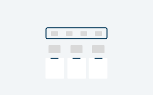
The List Collection Block is a block container for multiple List Blocks. The block arranges lists in columns with options for headers, hyperlinks, and additional content.

Slideshow Block
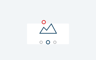
Slideshow block is used to show multiple images on a small portion of a screen.
Video Grouping Block
The Video Grouping Block displays a group of videos along with a transcript. It is a container block for two videos that appear side by side.
Video Listing Block
The Video Listing Block is an accordion-style block that displays a list of videos. The container functions like an accordion and is controlled by selecting a button.
Product Wall
Product Hub Wall
A product hub wall is a large, interactive header that highlights various products. The product hub wall is typically used on the Products & Services Collection page template.

Product Detail Wall
A product detail wall in a DXP highlights products, provides info, and encourages engagement. Found on the Product Detail page, it lets content authors add products and a CTA to guide users.

Product Wall CTA Block
The Product Wall CTA Block is a design element that is used on Product Hub Wall and Product Detail Wall blocks. In the context of DXP it is used on Product Page Templates to highlight and encourage users to take action related to a product.

Product Bundle Block
A Product Bundles Block in DXP is an interactive header that highlights multiple products. Added to the Product & Services Listing Page via the product hub wall, it helps showcase offerings, share details, and drive user engagement.

Form Blocks
Mini Form Block
The mini form block is a simple form within a container in which facilitates interactions with our customers.
Form Block
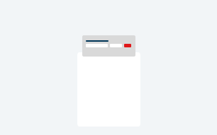
Explore this section to learn about forms with multiple question types.

Other Block Types
Data Table Block
The data table block is used to display information in a simple, tabular format.

iFrame Block
An inline frame (iframe) is a HTML element that loads another HTML page within the initial website page. Explore this block to learn more about iFrame.

Section Header Block
The section header block helps organize content by displaying a header, description, and optional button. It makes the content easy to scan, contributing to a clear structure that users can understand.